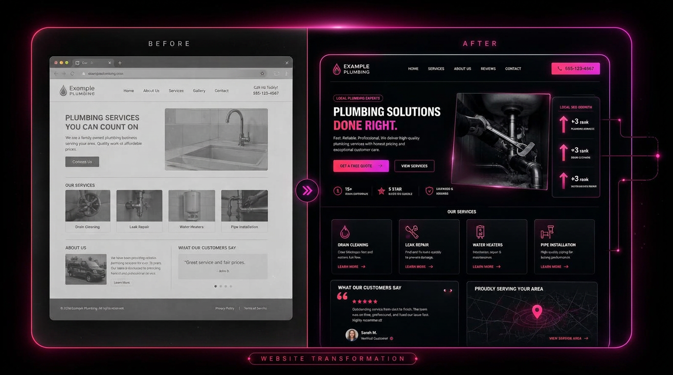
Before: pretty and invisible
Grey hero, stock photo, a headline that said 'Welcome to our website', no phone number above the fold, one page for six services, zero schema and no sitemap.
After: built to convert
Outcome headline with the service and market in it, tap-to-call in the header, trust row of badges, six dedicated service pages, LocalBusiness plus Service schema, and a quote form on every single page.
The result
Same business, same offer. The difference was structure and clarity — not a new logo.